Prize(s) Winners in Interior Architectural Illumination
Lighting Design/Product Company MMLD Co., Ltd.
Lead Designers Miki Matsushita
Other Designer's names Motohiko Nakamura
Photo Credits Photo by Nacása & Partners Inc.
Completion Date 2020.10
Project Location Tokyo, Japan
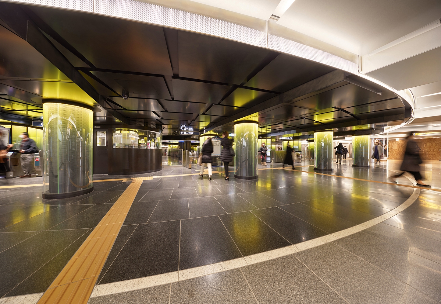
Entry DescriptionGinza Station has three lines; the Ginza, Hibiya and Marunouchi lines. We wanted to renovate the vast station in a way which allows people to perceive directions intuitively, by using lighting.
Firstly, we decided on simple shapes which were inspired by the first letters of each line’s name. A circle indicates G, a square represents H and a triangle implies M. Based on these simple shapes, we added traditional Japanese patterns to create the new stylized letters of G, H, M. Lastly, we created original light colours. Lemon Yellow, White Silver, and Cherry Red colour were applied for the Ginza, Hibiya, and Marunouchi lines respectively. It is a public space, so we are also concerned about safety. The average illuminance of whole area is 200lx, by dimmable, 3000K-5000K fixtures. All lighting fixtures are given a non-combustible treatment.
There were realistic obstacles to overcome such as limited construction time when people didn’t use the station and extremely low ceilings due to the age of the station. However, to create another era for Ginza station we put our effort for more than three years and now the lights lead passengers from the underground world to the surface above.


